Exam 3: Graphical Descriptive Techniques 2
Exam 1: What Is Statistics46 Questions
Exam 2: Graphical Descriptive Techniques 194 Questions
Exam 3: Graphical Descriptive Techniques 2156 Questions
Exam 4: Numerical Descriptive Techniques275 Questions
Exam 5: Data Collection and Sampling84 Questions
Exam 6: Probability240 Questions
Exam 7: Random Variables and Discrete Probability Distributions283 Questions
Exam 8: Continuous Probability Distributions224 Questions
Exam 9: Sampling Distributions156 Questions
Exam 10: Introduction to Estimation154 Questions
Exam 11: Introduction to Hypothesis Testing189 Questions
Exam 12: Inference About a Population153 Questions
Exam 13: Inference About Comparing Two Populations170 Questions
Exam 14: Analysis of Variance157 Questions
Exam 15: Chi-Squared Tests179 Questions
Exam 16: Simple Linear Regression and Correlation304 Questions
Exam 17: Multiple Regression160 Questions
Exam 18: Model Building148 Questions
Exam 19: Nonparametric Statistics175 Questions
Exam 20: Time-Series Analytics and Forecasting225 Questions
Exam 21: Statistical Process Control140 Questions
Exam 22: Decision Analysis123 Questions
Exam 23: Conclusion47 Questions
Select questions type
A histogram is said to be symmetric if,when we draw a vertical line down the center of the histogram the two sides are nearly identical.
(True/False)
4.8/5  (31)
(31)
Differences in the frequencies of a histogram appear to be more dramatic if you ____________________ the vertical axis.
(Short Answer)
5.0/5 (32)
Which of the following statements about shapes of histograms is true?
(Multiple Choice)
4.9/5 (33)
A line chart showing the number of crimes in Las Vegas from 2000 to 2005 may exhibit a totally different trend than a line chart showing the crime rate in Las Vegas from 2000 to 2005.(Crime rate is defined as number of crimes per 100,000 people.)
(True/False)
4.8/5 (32)
Credit Hours The College of Business at The State University of California produced 3,400 credit hours during Spring Semester,2011he number and percentage of credit hours produced by each of the four departments in the College of Business is shown below. 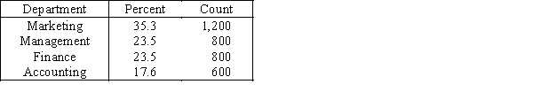 The following three-dimensional pie chart was constructed from the table above.
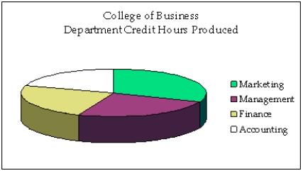
-{Credit Hours Narrative} Construct a two-dimensional pie chart showing the percentages of credit hours produced by the four departments.
-{Credit Hours Narrative} Construct a two-dimensional pie chart showing the percentages of credit hours produced by the four departments.
(Essay)
4.7/5 (32)
When one variable increases and the other decreases,we say that there is a(n)____________________ relationship between these two variables.
(Short Answer)
4.8/5 (29)
The more observations we have,the ____________________ the number of class intervals we need to use to draw a useful histogram.
(Short Answer)
4.8/5 (25)
The line chart below shows tomato prices each month from January (month 1)to December last year ($ per pound).By looking at this chart you can see the lowest tomato prices occurred in July. 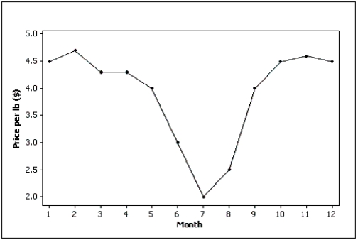
(True/False)
4.7/5 (42)
Which of the following statements about histograms is true?
(Multiple Choice)
4.9/5 (29)
A popular method of creating distorted impressions with bar charts is to construct the bars so that their widths are proportional to their heights.
(True/False)
4.9/5 (30)
An economics professor wants to study the relationship between income and education.A sample of 10 individuals is selected at random,and their income (in thousands of dollars)and education (in years)are shown below: 
a.Draw a scatter diagram for these data with the income on the vertical axis.
b.Describe the relationship between income and education.
a.Draw a scatter diagram for these data with the income on the vertical axis.
b.Describe the relationship between income and education.
(Essay)
4.9/5 (37)
The relationship between two interval variables is graphically displayed by a
(Multiple Choice)
4.8/5 (32)
Which of the following is the method statisticians use to draw the best fitting straight line through the data on a scatter diagram?
(Multiple Choice)
4.8/5 (40)
The two most important characteristics to examine in a scatter diagram are the number of possible categories for X and Y and the number of observations in each category.
(True/False)
4.9/5 (43)
Credit Hours The College of Business at The State University of California produced 3,400 credit hours during Spring Semester,2011he number and percentage of credit hours produced by each of the four departments in the College of Business is shown below. The following three-dimensional pie chart was constructed from the table above.
-{Credit Hours Narrative} In what way does the original three-dimensional pie chart distort the data,compared to a two-dimensional pie chart?
(Essay)
4.8/5 (28)
Fifty two truck buyers were asked to indicate the car dealer they believed offered the best overall service.The four choices were A,B,C,and D as shown below: 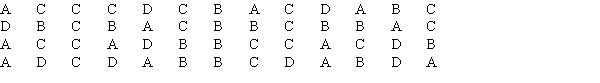 Construct a table showing the frequencies and relative frequencies for this data set.What proportion of car buyers rated dealer D as the best?
(Essay)
4.9/5 (34)
Filters
- Essay(0)
- Multiple Choice(0)
- Short Answer(0)
- True False(0)
- Matching(0)