Exam 3: Finding Relationships Among Variables
Exam 1: Introduction to Business Analytics29 Questions
Exam 2: Describing the Distribution of a Single Variable100 Questions
Exam 3: Finding Relationships Among Variables85 Questions
Exam 4: Probability and Probability Distributions114 Questions
Exam 5: Normal, Binomial, Poisson, and Exponential Distributions125 Questions
Exam 6: Decision Making Under Uncertainty107 Questions
Exam 7: Sampling and Sampling Distributions90 Questions
Exam 8: Confidence Interval Estimation84 Questions
Exam 9: Hypothesis Testing87 Questions
Exam 10: Regression Analysis: Estimating Relationships92 Questions
Exam 11: Regression Analysis: Statistical Inference82 Questions
Exam 12: Time Series Analysis and Forecasting106 Questions
Exam 13: Introduction to Optimization Modeling97 Questions
Exam 14: Optimization Models114 Questions
Exam 15: Introduction to Simulation Modeling82 Questions
Exam 16: Simulation Models102 Questions
Exam 17: Data Mining20 Questions
Exam 18: Importing Data Into Excel19 Questions
Exam 19: Analysis of Variance and Experimental Design20 Questions
Exam 20: Statistical Process Control20 Questions
Select questions type
Suppose that the table shown below contains information technology (IT) investment as a percentage of total investment for eight countries during a recent decade. It also contains the average annual percentage change in employment during this decade. Explain how these data shed light on the question of whether IT investment creates or costs jobs. (Hint: Use the data to construct a scatterplot.) 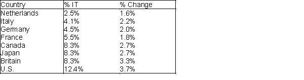
(Essay)
4.9/5  (33)
(33)
The Filters field of a pivot table contains the data that you want summarized.
(True/False)
4.8/5 (24)
A sample of 30 schools produced the pivot table shown below for the average percentage of students graduating from high school. Use this table to determine how the type of school (public or Catholic) that students attend affects their chance of graduating from high school. 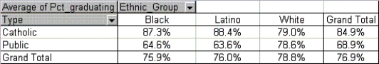
(Essay)
4.9/5 (35)
A trend line on a scatterplot is a line or a curve that "fits" the scatter as well as possible.
(True/False)
4.8/5 (36)
If the sample is a good representation of the population, what percentage of those who spent the weekend studying should we expect to do poorly on the final exam?
(Short Answer)
4.8/5 (34)
We can infer that there is a strong relationship between two numerical variables when:
(Multiple Choice)
4.9/5 (29)
The limitation of covariance as a descriptive measure of association is that it
(Multiple Choice)
4.8/5 (37)
If the correlation of variables is close to 0, then we expect to see:
(Multiple Choice)
4.9/5 (32)
Side-by-side box plots allow you to quickly see how two or more categories of a numerical variable compare.
(True/False)
4.9/5 (35)
Data has been collected on store size in square feet and profit per square foot, yielding the following observations: 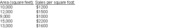 How is the value of the correlation affected in each of the following cases?
a) Each X value is multiplied by 4.
b) Each X value is switched with the corresponding Y value.
c) Each X value is increased by 2.
How is the value of the correlation affected in each of the following cases?
a) Each X value is multiplied by 4.
b) Each X value is switched with the corresponding Y value.
c) Each X value is increased by 2.
(Essay)
4.8/5 (34)
An economic development researcher wants to understand the relationship between the average monthly expenditure on utilities for households in a particular middle-class neighborhood and each of the following household variables: family size, approximate location of the household within the neighborhood, and indication of whether those surveyed owned or rented their home, gross annual income of the first household wage earner, gross annual income of the second household wage earner (if applicable), size of the monthly home mortgage or rent payment, and the total indebtedness (excluding the value of a home mortgage) of the household.
The correlation for each pairing of variables are shown in the table below:
Table of correlations 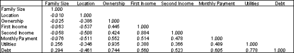 -Which of the variables have a positive linear relationship with the household's average monthly expenditure on utilities?
(Essay)
4.7/5 (33)
Tables used to display counts of a categorical variable are called:
(Multiple Choice)
4.9/5 (40)
Approximate the percentage of these Internet users who are in the 58-71 age group.
(Short Answer)
4.9/5 (40)
What is the average annual salary of the employed Internet users in this sample?
(Short Answer)
4.7/5 (35)
Suppose that the percentage of a country's population without health insurance coverage based on samples from all its regions for both 2016 and 2017 produced the following table of correlations.
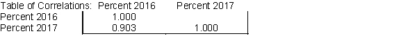
What does the table for the two given sets of percentages tell you in this case?
What does the table for the two given sets of percentages tell you in this case?
(Essay)
4.9/5 (26)
If the standard deviations of X and Y are 15.5 and 10.8, respectively, and the covariance of X and Y is 128.8, then the correlation coefficient is approximately 0.77.
(True/False)
4.8/5 (36)
Correlation can be affected by the measurement scales applied to X and Y variables.
(True/False)
4.8/5 (35)
Approximate the percentage of these internet users who are women.
(Short Answer)
4.9/5 (36)
The scatterplot is a graphical technique used to indicate the relationship between two numerical variables.
(True/False)
4.9/5 (35)
Filters
- Essay(0)
- Multiple Choice(0)
- Short Answer(0)
- True False(0)
- Matching(0)