Exam 3: Where Prices Come From: The Interaction of Supply and Demand
Exam 1: Economics: Foundations and Models148 Questions
Exam 2: Trade-Offs, Comparative Advantage, and the Market System314 Questions
Exam 3: Where Prices Come From: The Interaction of Supply and Demand314 Questions
Exam 4: GDP: Measuring Total Production and Income277 Questions
Exam 5: Unemployment and Inflation300 Questions
Exam 6: Economic Growth, The Financial System, and Business Cycles262 Questions
Exam 7: Long-Run Economic Growth: Sources and Policies280 Questions
Exam 8: Aggregate Expenditure and Output in the Short Run315 Questions
Exam 9: Aggregate Demand and Aggregate Supply Analysis246 Questions
Exam 10: Money, Banks, and the Bank of Canada285 Questions
Exam 11: Monetary Policy281 Questions
Exam 12: Fiscal Policy303 Questions
Exam 13: Inflation, Unemployment, and Bank of Canada Policy265 Questions
Exam 14: Macroeconomics in an Open Economy280 Questions
Exam 15: The International Financial System228 Questions
Select questions type
As the number of firms in a market increases, the supply curve will shift to the left and the equilibrium price will rise.
Free
(True/False)
4.8/5  (37)
(37)
Correct Answer: Verified
False
Figure 3.16  Alt text for Figure 3.16: In figure 3.16, a graph plotting intersecting demand and supply curves represents the change in equilibrium point in the motorcycle market with the increase in price of engines and wages of motorcycle manufacturers.
Long description for Figure 3.16: The x-axis is labelled, Quantity and the y-axis is labelled, Price.Curve D1 is a straight line which slopes down from the top left corner to the bottom right corner.Curve D2 is parallel with curve D1, but is plotted to the left.Curve S1 is a straight line which slopes up from the bottom right corner to the top left corner.Curve S2 is parallel to curve S1, but is plotted to the left.The 4 curves intersect at 4 points; A, B, on the right side of the lines, and C and D, on the left sides of the lines
-Refer to Figure 3.16.The graph in this figure illustrates an initial competitive equilibrium in the market for motorcycles at the intersection of D1 and S1 (point
Alt text for Figure 3.16: In figure 3.16, a graph plotting intersecting demand and supply curves represents the change in equilibrium point in the motorcycle market with the increase in price of engines and wages of motorcycle manufacturers.
Long description for Figure 3.16: The x-axis is labelled, Quantity and the y-axis is labelled, Price.Curve D1 is a straight line which slopes down from the top left corner to the bottom right corner.Curve D2 is parallel with curve D1, but is plotted to the left.Curve S1 is a straight line which slopes up from the bottom right corner to the top left corner.Curve S2 is parallel to curve S1, but is plotted to the left.The 4 curves intersect at 4 points; A, B, on the right side of the lines, and C and D, on the left sides of the lines
-Refer to Figure 3.16.The graph in this figure illustrates an initial competitive equilibrium in the market for motorcycles at the intersection of D1 and S1 (point
Free
(Multiple Choice)
4.8/5 (39)
Correct Answer:Verified
C
Figure 3.4 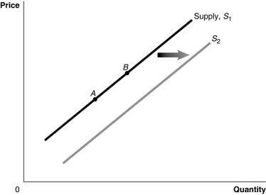 Alt text for Figure 3.4: In figure 3.4, a graph of the effect of technological advancement on supply curve.
Long description for Figure 3.4: The x-axis is labelled, Quantity, and the y-axis is labelled, Price.Curve Supply, S1, is a straight line which slopes up from the bottom left corner to the top right corner.2 points, A and B, are marked in the middle of curve S1.Curve S2 follows the same slope as curve S1, but is plotted to the right.A right pointing arrow indicates the change from curve S1 to curve S2.
-Refer to Figure 3.4.A decrease in the price of inputs would be represented by a movement from
Alt text for Figure 3.4: In figure 3.4, a graph of the effect of technological advancement on supply curve.
Long description for Figure 3.4: The x-axis is labelled, Quantity, and the y-axis is labelled, Price.Curve Supply, S1, is a straight line which slopes up from the bottom left corner to the top right corner.2 points, A and B, are marked in the middle of curve S1.Curve S2 follows the same slope as curve S1, but is plotted to the right.A right pointing arrow indicates the change from curve S1 to curve S2.
-Refer to Figure 3.4.A decrease in the price of inputs would be represented by a movement from
Free
(Multiple Choice)
4.9/5 (32)
Correct Answer:Verified
C
Figure 3.8 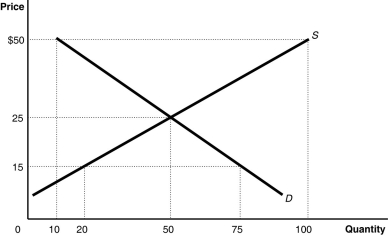 Alt text for Figure 3.8: In figure 3.8, a graph plotting intersecting supply and demand curves represents the market for canvas tote bags.
Long description for Figure 3.8: The x-axis is labelled, Quantity, with the values 0, 10, 20, 50, 75, and 100 marked.The y-axis is labelled, Price, with the values 0, 15, 25, and 50 dollars marked.Curve D is a straight line which slopes down from the top left corner to the bottom right corner.Curve S is a straight line which begins in the bottom left corner and slopes up to the top right corner.The equilibrium of the 2 curves is (50,25).The point plotted on curve S to the left of equilibrium is (20,15).The point plotted on curve D to the right of point of equilibrium is (75,15).The point plotted to the right of equilibrium on curve S is (100,50).The point plotted to the right of the equilibrium on curve D is (10,50).
-Refer to Figure 3.8.The figure above represents the market for canvas tote bags.Compare the conditions in the market when the price is $50 and when the price is $35.Which of the following describes how the market differs at these prices?
Alt text for Figure 3.8: In figure 3.8, a graph plotting intersecting supply and demand curves represents the market for canvas tote bags.
Long description for Figure 3.8: The x-axis is labelled, Quantity, with the values 0, 10, 20, 50, 75, and 100 marked.The y-axis is labelled, Price, with the values 0, 15, 25, and 50 dollars marked.Curve D is a straight line which slopes down from the top left corner to the bottom right corner.Curve S is a straight line which begins in the bottom left corner and slopes up to the top right corner.The equilibrium of the 2 curves is (50,25).The point plotted on curve S to the left of equilibrium is (20,15).The point plotted on curve D to the right of point of equilibrium is (75,15).The point plotted to the right of equilibrium on curve S is (100,50).The point plotted to the right of the equilibrium on curve D is (10,50).
-Refer to Figure 3.8.The figure above represents the market for canvas tote bags.Compare the conditions in the market when the price is $50 and when the price is $35.Which of the following describes how the market differs at these prices?
(Multiple Choice)
4.7/5 (39)
Which of the following would cause a decrease in the equilibrium price and an increase in the equilibrium quantity of salmon?
(Multiple Choice)
4.8/5 (38)
If consumers believe the price of iPads will decrease in the future, this will cause the demand for iPads to decrease now.
(True/False)
4.8/5 (36)
A change in supply is represented by a shift of the supply curve.
(True/False)
4.8/5 (39)
Figure 3.14 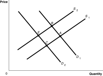 Alt text for Figure 3.14: In figure 3.14, a graph plotting intersecting demand and supply curves represents the change in equilibrium point in the apple market with the decrease in the price of a substitute fruit, orange and the increase in the wages of apple workers.
Long description for Figure 3.14: The x-axis is labelled, Quantity and the y-axis is labelled, Price.Curve D1 is a straight line which slopes down from the top left corner to the bottom right corner.Curve D2 is parallel with curve D1, but is plotted to the left.Curve S1 is a straight line which slopes up from the bottom right corner to the top left corner.Curve S2 is parallel to curve S1, but is plotted to the left.The 4 curves intersect at 4 points; A, B, on the right side of the lines, and C and D, on the left sides of the lines.
-Refer to Figure 3.14.The graph in this figure illustrates an initial competitive equilibrium in the market for apples at the intersection of D1 and S1 (point
Alt text for Figure 3.14: In figure 3.14, a graph plotting intersecting demand and supply curves represents the change in equilibrium point in the apple market with the decrease in the price of a substitute fruit, orange and the increase in the wages of apple workers.
Long description for Figure 3.14: The x-axis is labelled, Quantity and the y-axis is labelled, Price.Curve D1 is a straight line which slopes down from the top left corner to the bottom right corner.Curve D2 is parallel with curve D1, but is plotted to the left.Curve S1 is a straight line which slopes up from the bottom right corner to the top left corner.Curve S2 is parallel to curve S1, but is plotted to the left.The 4 curves intersect at 4 points; A, B, on the right side of the lines, and C and D, on the left sides of the lines.
-Refer to Figure 3.14.The graph in this figure illustrates an initial competitive equilibrium in the market for apples at the intersection of D1 and S1 (point
(Multiple Choice)
4.8/5 (37)
If the quantity of nail polish supplied is represented by the equation QS = -3 + 2P, then the corresponding price of nail polish is represented by the equation
(Multiple Choice)
4.9/5 (37)
Figure 3.2 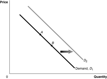 Alt text for Figure 3.2: In figure 3.2, a graph of the effect of an increase in the price of a complement on demand curve.
Long description for Figure 3.2: The x-axis is labelled, Quantity, and y-axis is labelled, Price.Curve Demand, D1, is a straight line which slopes down from the top left corner to the bottom right corner.Curve D2 follows the same slope as curve D1, but is plotted to the right.2 points, A and B, are plotted in the middle of curve D1.A right pointing arrow indicates the change from curve D1 to curve D2.
-Refer to Figure 3.2.An increase in the price of a complement would be represented by a movement from
Alt text for Figure 3.2: In figure 3.2, a graph of the effect of an increase in the price of a complement on demand curve.
Long description for Figure 3.2: The x-axis is labelled, Quantity, and y-axis is labelled, Price.Curve Demand, D1, is a straight line which slopes down from the top left corner to the bottom right corner.Curve D2 follows the same slope as curve D1, but is plotted to the right.2 points, A and B, are plotted in the middle of curve D1.A right pointing arrow indicates the change from curve D1 to curve D2.
-Refer to Figure 3.2.An increase in the price of a complement would be represented by a movement from
(Multiple Choice)
4.7/5 (43)
If the quantity of tacos demanded is represented by the equation QD = 20 - 0.5P, then the corresponding price of tacos is represented by the equation
(Multiple Choice)
4.7/5 (35)
Figure 3.4 Alt text for Figure 3.4: In figure 3.4, a graph of the effect of technological advancement on supply curve.
Long description for Figure 3.4: The x-axis is labelled, Quantity, and the y-axis is labelled, Price.Curve Supply, S1, is a straight line which slopes up from the bottom left corner to the top right corner.2 points, A and B, are marked in the middle of curve S1.Curve S2 follows the same slope as curve S1, but is plotted to the right.A right pointing arrow indicates the change from curve S1 to curve S2.
-Refer to Figure 3.4.An increase in the expected future price of the product would be represented by a movement from
(Multiple Choice)
4.8/5 (30)
Discuss the correct and incorrect economic analysis in the following statements.
"Unifor (the union that represents Canadian auto workers, among other industries)has successfully negotiated a 9 percent increase in wages for its workers.This increase in the wage rate causes an increase in demand for automobiles, since many consumers now have greater incomes, and also causes a decrease in supply of automobiles because the cost of production has increased.These effects cancel each other out resulting in no change in the equilibrium price and quantity in the automobile market."
(Essay)
4.7/5 (36)
A movement along the demand curve for toothpaste would be caused by
(Multiple Choice)
4.8/5 (40)
An increase in the price of music streaming services will result in
(Multiple Choice)
4.9/5 (36)
Filters
- Essay(0)
- Multiple Choice(0)
- Short Answer(0)
- True False(0)
- Matching(0)