Exam 3: Where Prices Come From: The Interaction of Supply and Demand
Exam 1: Economics: Foundations and Models148 Questions
Exam 2: Trade-Offs, Comparative Advantage, and the Market System314 Questions
Exam 3: Where Prices Come From: The Interaction of Supply and Demand314 Questions
Exam 4: GDP: Measuring Total Production and Income277 Questions
Exam 5: Unemployment and Inflation300 Questions
Exam 6: Economic Growth, The Financial System, and Business Cycles262 Questions
Exam 7: Long-Run Economic Growth: Sources and Policies280 Questions
Exam 8: Aggregate Expenditure and Output in the Short Run315 Questions
Exam 9: Aggregate Demand and Aggregate Supply Analysis246 Questions
Exam 10: Money, Banks, and the Bank of Canada285 Questions
Exam 11: Monetary Policy281 Questions
Exam 12: Fiscal Policy303 Questions
Exam 13: Inflation, Unemployment, and Bank of Canada Policy265 Questions
Exam 14: Macroeconomics in an Open Economy280 Questions
Exam 15: The International Financial System228 Questions
Select questions type
The demand and supply equations for the peach market are:
Demand: P = 24 - 0.5Q
Supply: P = -6 + 2.5Q
where P = price per bushel, and Q = quantity (in thousands).
a.Calculate the equilibrium price and quantity.
b.Suppose the government guaranteed producers a price of $24 per bushel.What would be the effect on quantity supplied? Provide a numerical value.
c.By how much would the $24 price change the quantity of peaches demanded? Provide
a numerical value.
d.Would there be a shortage or surplus of peaches?
e.What is the size of this shortage or surplus? Provide a numerical value.
(Essay)
4.8/5  (41)
(41)
A decrease in the equilibrium price for a product will result
(Multiple Choice)
4.8/5 (45)
A(n)________ is represented by a rightward shift of the demand curve while a(n)________ is represented by a movement along a given demand curve.
(Multiple Choice)
4.8/5 (37)
Atlantic salmon is an increasingly popular dish.It is also increasingly produced using aquaculture (fish farming)on Canada's east coast.If a hurricane destroys aquaculture facilities, how will this affect the equilibrium price and quantity of Atlantic salmon?
(Essay)
4.7/5 (32)
Which of the following would shift the supply curve for music streaming apps to the right?
(Multiple Choice)
4.9/5 (37)
Table 3.2  -Refer to Table 3.2.The table above shows the demand schedules for Kona coffee of two individuals (Luke and Ravi)and the rest of the market.At a price of $6, the quantity demanded in the market would be
(Multiple Choice)
4.8/5 (40)
Figure 3.6 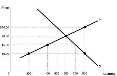 Alt text for Figure 3.6: In figure 3.6, a graph of intersecting supply and demand curves illustrates shortage and surplus in a market, along with its equilibrium.
Long description for Figure 3.6: The x-axis is labelled, Quantity, with the values 0, 200, 400, 500, 600, 700 and 800 marked.The y-axis is labelled, Price, with the values 0, 10.00, 15.00, 20.00 and 25.00 dollars marked.Curve Supply S is a straight line which slopes up from the bottom left corner to the top right corner.4 points are plotted along the curve; (200, 10), (400, 15), (600, 20), and (800, 25).Demand curve D is a straight line which slopes down from the top left corner to the bottom right corner.Curve D intersects the S curve at (600, 20), and passes through another point, (800, 10).All plotted points are connected to the corresponding values on the x and y-axis with dotted lines.
-Refer to Figure 3.6.If the current market price is $10, the market will achieve equilibrium by
Alt text for Figure 3.6: In figure 3.6, a graph of intersecting supply and demand curves illustrates shortage and surplus in a market, along with its equilibrium.
Long description for Figure 3.6: The x-axis is labelled, Quantity, with the values 0, 200, 400, 500, 600, 700 and 800 marked.The y-axis is labelled, Price, with the values 0, 10.00, 15.00, 20.00 and 25.00 dollars marked.Curve Supply S is a straight line which slopes up from the bottom left corner to the top right corner.4 points are plotted along the curve; (200, 10), (400, 15), (600, 20), and (800, 25).Demand curve D is a straight line which slopes down from the top left corner to the bottom right corner.Curve D intersects the S curve at (600, 20), and passes through another point, (800, 10).All plotted points are connected to the corresponding values on the x and y-axis with dotted lines.
-Refer to Figure 3.6.If the current market price is $10, the market will achieve equilibrium by
(Multiple Choice)
4.9/5 (44)
The portion of the population over age 64 has risen from 8% in 1971 to 16% in 2015. Which of the goods is most likely to see an increase in demand as a result?
(Multiple Choice)
4.8/5 (42)
George Gnat subscribes to a monthly pest control service for his home.Last week the owner of the service informed George that he will have to raise his monthly service fee because of increases in the price of gasoline used by his workers on their service trips.How is the market for pest control services affected by this?
(Multiple Choice)
4.8/5 (40)
In October, market analysts predict that the price of platinum will fall in November.What happens in the platinum market in October, holding everything else constant?
(Multiple Choice)
4.8/5 (37)
How has the growing popularity of on-line shopping affected the market for clothing at retail department stores?
(Multiple Choice)
4.8/5 (38)
Which of the following would cause an increase in the supply of cheese?
(Multiple Choice)
4.8/5 (41)
If the demand for a product decreases and the supply of the product does not change, equilibrium price and equilibrium quantity will both increase.
(True/False)
4.7/5 (29)
Figure 3.3 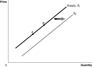 Alt text for Figure 3.3: In figure 3.3, a graph of the effect of an increase in the price of inputs on the supply curve.
Long description for Figure 3.3: The x-axis is labelled, Quantity, and the y-axis is labelled, Price.Curve Supply, S1, is a straight line which slopes up from the bottom left corner to the top right corner.2 points, A and B, are marked in the middle of curve S1.Curve S2 follows the same slope as curve S1, but is plotted to the right.A right pointing arrow indicates the change from curve S1 to curve S2.
-Refer to Figure 3.3.An increase in price of inputs would be represented by a movement from
Alt text for Figure 3.3: In figure 3.3, a graph of the effect of an increase in the price of inputs on the supply curve.
Long description for Figure 3.3: The x-axis is labelled, Quantity, and the y-axis is labelled, Price.Curve Supply, S1, is a straight line which slopes up from the bottom left corner to the top right corner.2 points, A and B, are marked in the middle of curve S1.Curve S2 follows the same slope as curve S1, but is plotted to the right.A right pointing arrow indicates the change from curve S1 to curve S2.
-Refer to Figure 3.3.An increase in price of inputs would be represented by a movement from
(Multiple Choice)
4.8/5 (43)
Table 3.3  -Refer to Table 3.3.The table contains information about the corn market.Use the table to answer the following questions.
a.What are the equilibrium price and quantity of corn?
b.Suppose the prevailing price is $9 per bushel.Is there a shortage or a surplus in the market?
c.What is the quantity of the shortage or surplus?
d.How many bushels will be sold if the market price is $9 per bushel?
e.If the market price is $9 per bushel, what must happen to restore equilibrium in the market?
f.At what price will suppliers be able to sell 22,000 bushels of corn?
g.Suppose the market price is $21 per bushel.Is there a shortage or a surplus in the market?
h.What is the quantity of the shortage or surplus?
i.How many bushels will be sold if the market price is $21 per bushel?
j.If the market price is $21 per bushel, what must happen to restore equilibrium in the market?
-Refer to Table 3.3.The table contains information about the corn market.Use the table to answer the following questions.
a.What are the equilibrium price and quantity of corn?
b.Suppose the prevailing price is $9 per bushel.Is there a shortage or a surplus in the market?
c.What is the quantity of the shortage or surplus?
d.How many bushels will be sold if the market price is $9 per bushel?
e.If the market price is $9 per bushel, what must happen to restore equilibrium in the market?
f.At what price will suppliers be able to sell 22,000 bushels of corn?
g.Suppose the market price is $21 per bushel.Is there a shortage or a surplus in the market?
h.What is the quantity of the shortage or surplus?
i.How many bushels will be sold if the market price is $21 per bushel?
j.If the market price is $21 per bushel, what must happen to restore equilibrium in the market?
(Essay)
4.9/5 (31)
Table 3.1  -Refer to Table 3.1.The table above shows the demand schedules for loose-leaf tea of two individuals (Sunil and Mia )and the rest of the market.If the price of loose-leaf tea rises from $3 to $4, the market quantity demanded would
(Multiple Choice)
4.9/5 (40)
In response to a shortage, the market price of a good will rise; as the price rises, demand will decrease and supply will increase until equilibrium is reached.
(True/False)
4.9/5 (35)
In each of the following situations, list what would happen to the equilibrium price and the equilibrium quantity for a particular product that is an inferior good.
a.Population decreases and productivity increases.
b.Income increases and the price of inputs increase.
c.The number of firms in the market decreases and income decreases.
d.Consumer preference decreases and the price of a complement increases.
e.The price of a substitute in consumption increases and the price of a substitute in production increases.
(Essay)
4.9/5 (42)
Figure 3.14 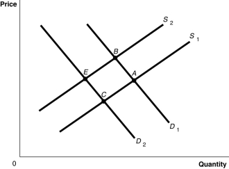 Alt text for Figure 3.14: In figure 3.14, a graph plotting intersecting demand and supply curves represents the change in equilibrium point in the apple market with the decrease in the price of a substitute fruit, orange and the increase in the wages of apple workers.
Long description for Figure 3.14: The x-axis is labelled, Quantity and the y-axis is labelled, Price.Curve D1 is a straight line which slopes down from the top left corner to the bottom right corner.Curve D2 is parallel with curve D1, but is plotted to the left.Curve S1 is a straight line which slopes up from the bottom right corner to the top left corner.Curve S2 is parallel to curve S1, but is plotted to the left.The 4 curves intersect at 4 points; A, B, on the right side of the lines, and C and D, on the left sides of the lines.
-Refer to Figure 3.14.The graph in this figure illustrates an initial competitive equilibrium in the market for apples at the intersection of D2 and S2 (point
Alt text for Figure 3.14: In figure 3.14, a graph plotting intersecting demand and supply curves represents the change in equilibrium point in the apple market with the decrease in the price of a substitute fruit, orange and the increase in the wages of apple workers.
Long description for Figure 3.14: The x-axis is labelled, Quantity and the y-axis is labelled, Price.Curve D1 is a straight line which slopes down from the top left corner to the bottom right corner.Curve D2 is parallel with curve D1, but is plotted to the left.Curve S1 is a straight line which slopes up from the bottom right corner to the top left corner.Curve S2 is parallel to curve S1, but is plotted to the left.The 4 curves intersect at 4 points; A, B, on the right side of the lines, and C and D, on the left sides of the lines.
-Refer to Figure 3.14.The graph in this figure illustrates an initial competitive equilibrium in the market for apples at the intersection of D2 and S2 (point
(Multiple Choice)
4.8/5 (38)
Filters
- Essay(0)
- Multiple Choice(0)
- Short Answer(0)
- True False(0)
- Matching(0)