Exam 3: Where Prices Come From: The Interaction of Supply and Demand
Exam 1: Economics: Foundations and Models148 Questions
Exam 2: Trade-Offs, Comparative Advantage, and the Market System314 Questions
Exam 3: Where Prices Come From: The Interaction of Supply and Demand314 Questions
Exam 4: GDP: Measuring Total Production and Income277 Questions
Exam 5: Unemployment and Inflation300 Questions
Exam 6: Economic Growth, The Financial System, and Business Cycles262 Questions
Exam 7: Long-Run Economic Growth: Sources and Policies280 Questions
Exam 8: Aggregate Expenditure and Output in the Short Run315 Questions
Exam 9: Aggregate Demand and Aggregate Supply Analysis246 Questions
Exam 10: Money, Banks, and the Bank of Canada285 Questions
Exam 11: Monetary Policy281 Questions
Exam 12: Fiscal Policy303 Questions
Exam 13: Inflation, Unemployment, and Bank of Canada Policy265 Questions
Exam 14: Macroeconomics in an Open Economy280 Questions
Exam 15: The International Financial System228 Questions
Select questions type
Figure 3.13 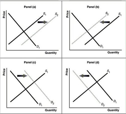 Alt text for Figure 3.13a: In figure 3.13a, a graph of intersecting demand and supply curves represents a rising supply of bicycle helmets.
Long description for Figure 3.13a: The x-axis is labelled, Quantity and the y-axis is labelled, as Price.Curve D1 is a straight line which slopes down from the top left corner to the bottom right corner.Curve S1 is a straight line which slopes up from the bottom left to the top right.The point of intersection is at the midpoints of both lines.Curve S2 is a straight line, parallel to curve S1, but plotted to the right.A right pointing arrow indicates the change from S1 to S2.
Alt text for Figure 3.13b: In figure 3.13b, a graph of intersecting demand and supply curves represents a falling supply of bicycle helmets.
Long description for Figure 3.13b: The x-axis is labelled, Quantity and the y-axis is labelled, as Price.Curve D1 is a straight line which slopes down from the top left corner to the bottom right corner.Curve S1 is a straight line which slopes up from the bottom left to the top right.The point of intersection is at the midpoints of both lines.Curve S2 is a straight line, parallel to curve S1, but plotted to the left.A left pointing arrow indicates the change from S1 to S2.
Alt text for Figure 3.13c: In figure 3.13c, a graph of intersecting demand and supply curves represents a rising demand for bicycle helmets.
Long description for Figure 3.13c: The x-axis is labelled, Quantity and the y-axis is labelled, as Price.Curve D1 is a straight line which slopes down from the top left corner to the bottom right corner.Curve S1 is a straight line which slopes up from the bottom left to the top right.The point of intersection is at the midpoints of both lines.Curve D2 is a straight line, parallel to curve D1, but plotted to the right.A right pointing arrow indicates the change from D1 to D2.
Alt text for Figure 3.13d: In figure 3.13d, a graph of intersecting demand and supply curves represents a falling demand for bicycle helmets.
Long description for Figure 3.13d: The x-axis is labelled, Quantity and the y-axis is labelled, as Price.Curve D1 is a straight line which slopes down from the top left corner to the bottom right corner.Curve S1 is a straight line which slopes up from the bottom left to the top right.The point of intersection is at the midpoints of both lines.Curve D2 is a straight line, parallel to curve D1, but plotted to the left.A left pointing arrow indicates the change from D1 to D2.
-Refer to Figure 3.13.Assume that the graphs in this figure represent the demand and supply curves for used clothing, an inferior good.Which panel describes what happens in this market as a result of a decrease in income?
Alt text for Figure 3.13a: In figure 3.13a, a graph of intersecting demand and supply curves represents a rising supply of bicycle helmets.
Long description for Figure 3.13a: The x-axis is labelled, Quantity and the y-axis is labelled, as Price.Curve D1 is a straight line which slopes down from the top left corner to the bottom right corner.Curve S1 is a straight line which slopes up from the bottom left to the top right.The point of intersection is at the midpoints of both lines.Curve S2 is a straight line, parallel to curve S1, but plotted to the right.A right pointing arrow indicates the change from S1 to S2.
Alt text for Figure 3.13b: In figure 3.13b, a graph of intersecting demand and supply curves represents a falling supply of bicycle helmets.
Long description for Figure 3.13b: The x-axis is labelled, Quantity and the y-axis is labelled, as Price.Curve D1 is a straight line which slopes down from the top left corner to the bottom right corner.Curve S1 is a straight line which slopes up from the bottom left to the top right.The point of intersection is at the midpoints of both lines.Curve S2 is a straight line, parallel to curve S1, but plotted to the left.A left pointing arrow indicates the change from S1 to S2.
Alt text for Figure 3.13c: In figure 3.13c, a graph of intersecting demand and supply curves represents a rising demand for bicycle helmets.
Long description for Figure 3.13c: The x-axis is labelled, Quantity and the y-axis is labelled, as Price.Curve D1 is a straight line which slopes down from the top left corner to the bottom right corner.Curve S1 is a straight line which slopes up from the bottom left to the top right.The point of intersection is at the midpoints of both lines.Curve D2 is a straight line, parallel to curve D1, but plotted to the right.A right pointing arrow indicates the change from D1 to D2.
Alt text for Figure 3.13d: In figure 3.13d, a graph of intersecting demand and supply curves represents a falling demand for bicycle helmets.
Long description for Figure 3.13d: The x-axis is labelled, Quantity and the y-axis is labelled, as Price.Curve D1 is a straight line which slopes down from the top left corner to the bottom right corner.Curve S1 is a straight line which slopes up from the bottom left to the top right.The point of intersection is at the midpoints of both lines.Curve D2 is a straight line, parallel to curve D1, but plotted to the left.A left pointing arrow indicates the change from D1 to D2.
-Refer to Figure 3.13.Assume that the graphs in this figure represent the demand and supply curves for used clothing, an inferior good.Which panel describes what happens in this market as a result of a decrease in income?
(Multiple Choice)
4.9/5  (34)
(34)
Which of the following products would be most likely to see a rise in demand due a drop in incomes?
(Multiple Choice)
5.0/5 (45)
Figure 3.3 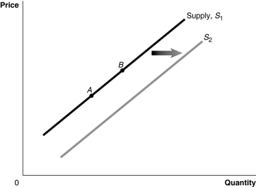 Alt text for Figure 3.3: In figure 3.3, a graph of the effect of an increase in the price of inputs on the supply curve.
Long description for Figure 3.3: The x-axis is labelled, Quantity, and the y-axis is labelled, Price.Curve Supply, S1, is a straight line which slopes up from the bottom left corner to the top right corner.2 points, A and B, are marked in the middle of curve S1.Curve S2 follows the same slope as curve S1, but is plotted to the right.A right pointing arrow indicates the change from curve S1 to curve S2.
-Refer to Figure 3.3.A decrease in the price of the product would be represented by a movement from
Alt text for Figure 3.3: In figure 3.3, a graph of the effect of an increase in the price of inputs on the supply curve.
Long description for Figure 3.3: The x-axis is labelled, Quantity, and the y-axis is labelled, Price.Curve Supply, S1, is a straight line which slopes up from the bottom left corner to the top right corner.2 points, A and B, are marked in the middle of curve S1.Curve S2 follows the same slope as curve S1, but is plotted to the right.A right pointing arrow indicates the change from curve S1 to curve S2.
-Refer to Figure 3.3.A decrease in the price of the product would be represented by a movement from
(Multiple Choice)
4.9/5 (29)
If an increase in income leads to in an increase in the demand for peanut butter, then peanut butter is
(Multiple Choice)
4.8/5 (36)
The substitution effect explains why there is an inverse relationship between the price of a product and the quantity of the product demanded.
(True/False)
4.8/5 (33)
A change in all of the following variables will change the market demand for a product except
(Multiple Choice)
4.8/5 (33)
Elvira decreased her consumption of bananas when the price of peanut butter increased.For Elvira, peanut butter and bananas are
(Multiple Choice)
4.9/5 (34)
If the price of grapefruit rises, the substitution effect due to the price change will cause
(Multiple Choice)
4.8/5 (44)
If the quantity demanded for a product exceeds the quantity supplied, the market price will rise until
(Multiple Choice)
5.0/5 (44)
Many universities offer student bus passes (often included with student fees)in an effort to reduce demand for on campus parking. This means universities must believe that
(Multiple Choice)
4.9/5 (32)
Assume that the hourly price for the services of tarot card readers has risen and sales of these services have also risen.One can conclude that
(Multiple Choice)
4.7/5 (38)
Hurricane Juan hit Halifax in 2003.The storm did over $300 million in damage.In the effort to repair the damage done by the storm, the prices of basic building materials and contractors increased dramatically.Many residents complained of profiteering and price gouging by contractors and home improvement stores.Which of the following offers the best explanation of the price increases people were seeing?
(Multiple Choice)
4.9/5 (33)
Prices of commercial airline tickets have fallen in recent months.Over this same period, the price of jet fuel has risen and consumer incomes have fallen.Which of the following best explains the falling prices of airline tickets? Assume that airline tickets are a normal good.
(Multiple Choice)
4.9/5 (38)
The Internet has created a new category in the book selling market, namely, the "barely used" book.How does the availability of barely used books affect the market for new books?
(Multiple Choice)
4.8/5 (41)
Figure 3.11  Alt text for Figure 3.11: In figure 3.11, a graph plotting intersecting supply and demand curves illustrates how supply and demand function in competitive markets.
Long description for Figure 3.11: The x-axis is labelled, Quantity, and is marked from 0 to 8 in increments of 2.The y-axis is labelled, Price, and is marked from 0 to 20 dollars in increments of 5.Curve D is a straight line which slopes down from the top left corner to the bottom right corner.Curve S is a straight line which begins in the bottom left corner and slopes up to the top right corner.The equilibrium of the 2 curves is marked at (4,10).2 points plotted on the demand curve to the left of the equilibrium are (0,20)and (2,15).2 points plotted on the demand curve to the right of the equilibrium are (6,5)and (8,0).2 points plotted on the supply curve to the right of the equilibrium are (6,15)and (8,20).2 points plotted on the supply curve to the left of the equilibrium are (2,5)and (0,0).
-Refer to Figure 3.11.At a price of $5,
Alt text for Figure 3.11: In figure 3.11, a graph plotting intersecting supply and demand curves illustrates how supply and demand function in competitive markets.
Long description for Figure 3.11: The x-axis is labelled, Quantity, and is marked from 0 to 8 in increments of 2.The y-axis is labelled, Price, and is marked from 0 to 20 dollars in increments of 5.Curve D is a straight line which slopes down from the top left corner to the bottom right corner.Curve S is a straight line which begins in the bottom left corner and slopes up to the top right corner.The equilibrium of the 2 curves is marked at (4,10).2 points plotted on the demand curve to the left of the equilibrium are (0,20)and (2,15).2 points plotted on the demand curve to the right of the equilibrium are (6,5)and (8,0).2 points plotted on the supply curve to the right of the equilibrium are (6,15)and (8,20).2 points plotted on the supply curve to the left of the equilibrium are (2,5)and (0,0).
-Refer to Figure 3.11.At a price of $5,
(Multiple Choice)
4.8/5 (39)
Studies have shown links between calcium consumption and a reduction in osteoporosis.How does this affect the market for calcium?
(Multiple Choice)
4.8/5 (36)
If the number of firms producing mouthwash increases and consumer preference for mouthwash increases, the equilibrium price of mouthwash will definitely increase.
(True/False)
4.9/5 (30)
If, for a product, the quantity supplied exceeds the quantity demanded, the market price will fall until
(Multiple Choice)
4.8/5 (42)
Figure 3.7 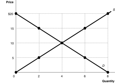 Alt text for Figure 3.7: In figure 3.7, a graph plotting intersecting supply and demand curves illustrates surplus and shortage in a market, along with an equilibrium.
Long description for Figure 3.7: The x-axis is labelled, Quantity, and is marked from 0 to 8 in increments of 2.The y-axis is labelled, Price, and is marked from 0 to 20 dollars in increments of 5.Curve D is a straight line which slopes down from the top left corner to the bottom right corner.Curve S is a straight line which begins in the bottom left corner and slopes up to the top right corner.The equilibrium of the 2 curves is marked at (4,10).2 points plotted on the demand curve to the left of the equilibrium are (0,20)and (2,15).2 points plotted on the demand curve to the right of the equilibrium are (6,5)and (8,0).2 points plotted on the supply curve to the right of the equilibrium are (6,15)and (8,20).2 points plotted on the supply curve to the left of the equilibrium are (2,5)and (0,0).
-Refer to Figure 3.7.In a free market such as that depicted above, a surplus is eliminated by
Alt text for Figure 3.7: In figure 3.7, a graph plotting intersecting supply and demand curves illustrates surplus and shortage in a market, along with an equilibrium.
Long description for Figure 3.7: The x-axis is labelled, Quantity, and is marked from 0 to 8 in increments of 2.The y-axis is labelled, Price, and is marked from 0 to 20 dollars in increments of 5.Curve D is a straight line which slopes down from the top left corner to the bottom right corner.Curve S is a straight line which begins in the bottom left corner and slopes up to the top right corner.The equilibrium of the 2 curves is marked at (4,10).2 points plotted on the demand curve to the left of the equilibrium are (0,20)and (2,15).2 points plotted on the demand curve to the right of the equilibrium are (6,5)and (8,0).2 points plotted on the supply curve to the right of the equilibrium are (6,15)and (8,20).2 points plotted on the supply curve to the left of the equilibrium are (2,5)and (0,0).
-Refer to Figure 3.7.In a free market such as that depicted above, a surplus is eliminated by
(Multiple Choice)
4.9/5 (30)
Several studies have shown promising links between green tea consumption and cancer prevention.How will this affect the market for green tea?
(Multiple Choice)
4.9/5 (41)
Filters
- Essay(0)
- Multiple Choice(0)
- Short Answer(0)
- True False(0)
- Matching(0)