Exam 2: Methods for Describing Sets of Data
Exam 1: Statistics, Data, and Statistical Thinking77 Questions
Exam 2: Methods for Describing Sets of Data187 Questions
Exam 3: Probability284 Questions
Exam 4: Discrete Random Variables134 Questions
Exam 5: Continuous Random Variables138 Questions
Exam 6: Sampling Distributions52 Questions
Exam 7: Inferences Based on a Single Sample: Estimation With Confidence Intervals125 Questions
Exam 8: Inferences Based on a Single144 Questions
Exam 9: Inferences Based on Two Samples: Confidence Intervals and Tests of Hypotheses100 Questions
Exam 10: Analysis of Variance: Comparing More Than Two Means91 Questions
Exam 11: Simple Linear Regression113 Questions
Exam 12: Multiple Regression and Model Building131 Questions
Exam 13: Categorical Data Analysis60 Questions
Exam 14: Nonparametric Statistics Available Online87 Questions
Select questions type
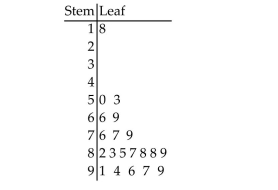
The scores for a statistics test are as follows: 87 76 91 77 94 96 88 85 66 89
79 97 50 99 83 88 82 53 18 69 Create a stem-and-leaf display for the data.
Free
(Essay)
4.8/5  (30)
(30)
Correct Answer: Verified
At the U.S. Open Tennis Championship a statistician keeps track of every serve that a player hits during the tournament. The lower quartile of a particular playerʹs serve speeds was reported to be
88 mph. Which of the following interpretations of this information is correct?
Free
(Multiple Choice)
4.9/5 (40)
Correct Answer:Verified
D
The following data represent the scores of 50 students on a statistics exam. 39 51 59 63 66 68 68 69 70 71 71 71 73 74 76 76 76 77 78 79 79 79 79 80 80 82 83 83 83 85 85 86 86 88 88 88 88 89 89 89 90 90 91 91 92 95 96 97 97 98 a. Find the lower quartile, the upper quartile, and the median of the scores.
b. Find the interquartile range of the data and use it to identify potential outliers.
c. In a box plot for the data, which scores, if any, would be outside the outer fences?
Which scores, if any, would be outside the inner fences but inside the outer fences?
Free
(Essay)
5.0/5 (35)
Correct Answer:Verified
a. The lower quartile is 73, the upper quartile is 89, and the median is 81.
b. The interquartile range is 89 - 73 = 16. The score of 39 is a potential outlier since
it is less than 73 - 1.5(16)= 49.
c. No scores fall outside the outer fences, 25 and 137. Only the score of 39 lies
between the inner and outer fences.
The table shows the number of each type of book found at an online auction site during a
recent search. 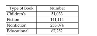 a. Construct a relative frequency table for the book data.
b. Construct a pie chart for the book data.
a. Construct a relative frequency table for the book data.
b. Construct a pie chart for the book data.
(Essay)
4.8/5 (27)
The following data represent the scores of 50 students on a statistics exam. The mean
score is 80.02, and the standard deviation is 11.9. 39 51 59 63 66 68 68 69 70 71 71 71 73 74 76 76 76 77 78 79 79 79 79 80 80 82 83 83 83 85 85 86 86 88 88 88 88 89 89 89 90 90 91 91 92 95 96 97 97 98 What percentage of the scores lies within one standard deviation of the mean? two
standard deviations of the mean? three standard deviations of the mean? Based on these
percentages, do you believe that the distribution of scores is mound-shaped and
symmetric? Explain.
(Essay)
4.8/5 (35)
Explain how stretching the vertical axis of a histogram can be misleading.
(Essay)
4.8/5 (34)
The distribution of scores on a test is mound-shaped and symmetric with a mean score of 78. If 68% of the scores fall between 72 and 84, which of the following is most likely to be the standard
Deviation of the distribution?
(Multiple Choice)
4.9/5 (33)
The slices of a pie chart must be arranged from largest to smallest in a clockwise direction.
(True/False)
4.9/5 (35)
The amount spent on textbooks for the fall term was recorded for a sample of five university students - $400, $350, $600, $525, and $450. Calculate the value of the sample standard deviation
For the data.
(Multiple Choice)
4.9/5 (24)
252 randomly sampled college students were asked, among other things, to estimate their college grade point average (GPA). The responses are shown in the stem-and-leaf plot shown below.
Notice that a GPA of 3.65 would be indicated with a stem of 36 and a leaf of 5 in the plot. How
Many of the students who responded had GPAʹs that exceeded 3.55? 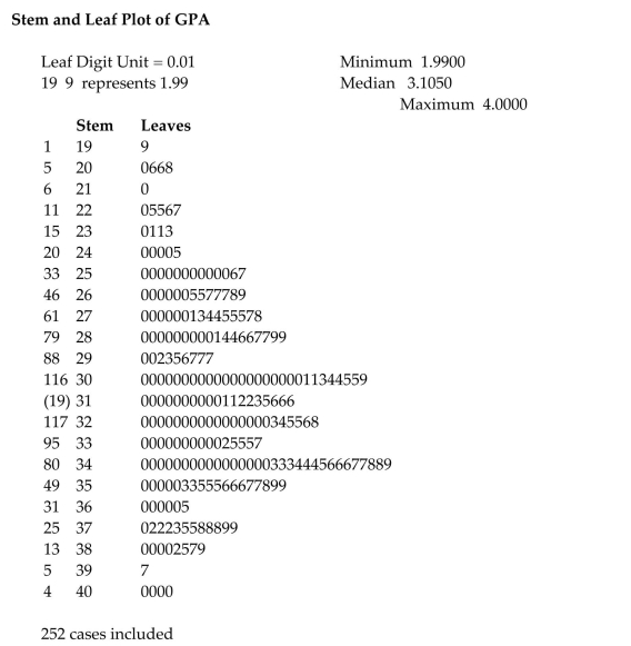
(Multiple Choice)
4.8/5 (30)
A study was designed to investigate the effects of two variables - (1)a studentʹs level of mathematical anxiety and (2)teaching method - on a studentʹs achievement in a mathematics
Course. Students who had a low level of mathematical anxiety were taught using the traditional
Expository method. These students obtained a mean score of 400 with a standard deviation of 40
On a standardized test. Assuming no information concerning the shape of the distribution is
Known, what percentage of the students scored between 320 and 480?
(Multiple Choice)
4.7/5 (36)
260 randomly sampled college students were asked, among other things, to state their year in school (freshman, sophomore, junior, or senior). The responses are shown in the bar graph below.
How many of the students who responded would be classified as upperclassmen (e.g., juniors or
Seniors)? 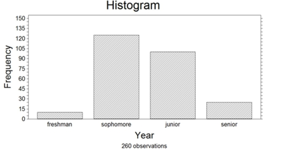
(Multiple Choice)
4.9/5 (34)
The distribution of salaries of professional basketball players is skewed to the right. Which measure of central tendency would be the best measure to determine the location of the center of
The distribution?
(Multiple Choice)
4.9/5 (36)
A standardized test has a mean score of 500 points with a standard deviation of 100 points. Five studentsʹ scores are shown below.
Adam: 575 Beth: 690 Carlos: 750 Doug: 280 Ella: 440
Which of the students have scores within two standard deviations of the mean?
(Multiple Choice)
4.8/5 (37)
The bars in a bar graph can be arranged by height in ascending order from left to right.
(True/False)
4.9/5 (48)
The calculator screens summarize a data set. 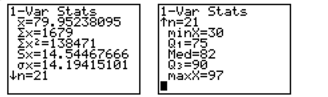 a. Identify the lower and upper quartiles of the data set.
b. Find the interquartile range.
c. Is there reason to suspect that the data may contain an outlier? Explain.
a. Identify the lower and upper quartiles of the data set.
b. Find the interquartile range.
c. Is there reason to suspect that the data may contain an outlier? Explain.
(Essay)
4.9/5 (35)
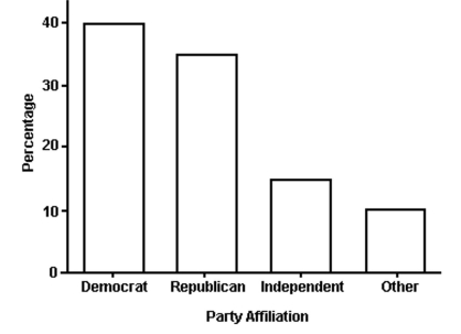 The bar graph shows the political affiliation of 1000 registered U.S. voters. What percentage of the voters belonged to one of the traditional two parties (Democratic or Republican)?
(Multiple Choice)
4.9/5 (31)
An annual survey sent to retail store managers contained the question ʺDid your store
suffer any losses due to employee theft?ʺ The responses are summarized in the table for
two years. Compare the responses for the two years using side-by-side bar charts. What
inferences can be made from the charts? Employee Percentage Theft Percentage in year 1 in year 2 Yes 34 23 No 51 68 Don't know 15 9 Totals 100 100
(Essay)
4.9/5 (32)
A frequency table displays the proportion of observations falling into each class.
(True/False)
4.9/5 (38)
Filters
- Essay(0)
- Multiple Choice(0)
- Short Answer(0)
- True False(0)
- Matching(0)