Exam 2: Graphical and Tabular Descriptive Techniques
Exam 1: What Is Statistics41 Questions
Exam 2: Graphical and Tabular Descriptive Techniques199 Questions
Exam 3: Numerical Descriptive Techniques226 Questions
Exam 4: Data Collection and Sampling82 Questions
Exam 5: Probability212 Questions
Exam 6: Random Variables and Discrete Probability Distributions174 Questions
Exam 7: Continuous Probability Distributions167 Questions
Exam 8: Sampling Distributions133 Questions
Exam 9: Introduction to Estimation88 Questions
Exam 10: Introduction to Hypothesis Testing186 Questions
Exam 11: Inference About a Population76 Questions
Exam 12: Inference About Comparing Two Populat85 Questions
Exam 13: Inference About Comparing Two Populat85 Questions
Exam 14: Analysis of Variance127 Questions
Exam 15: Chi-Squared Tests118 Questions
Exam 16: Simple Linear Regression and Correlat238 Questions
Exam 17: Multiple Regression147 Questions
Exam 18: Review of Statistical Inference189 Questions
Select questions type
{Teachers Ages Narrative} Draw a stem-and-leaf display of this data. What is the minimum and maximum age of the teachers in this data set?
(Essay)
4.8/5  (38)
(38)
A modal class is the class with the largest number of observations.
(True/False)
4.7/5 (35)
Insurance Company A representative from a local insurance agency selected a random sample of insured homeowners and recorded the number of claims made in the last three years, with the following results:  {Insurance Company Narrative} What number of claims was made by the highest proportion of homeowners?
(Essay)
4.8/5 (29)
Which of the following represents a graphical presentation of interval data?
(Multiple Choice)
5.0/5 (36)
The histogram below has a shape that is ____________________. 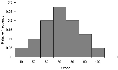
(Short Answer)
4.9/5 (44)
Insurance Company A representative from a local insurance agency selected a random sample of insured homeowners and recorded the number of claims made in the last three years, with the following results: 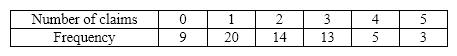 {Insurance Company Narrative} How many homeowners are represented in the sample?
(Essay)
4.7/5 (40)
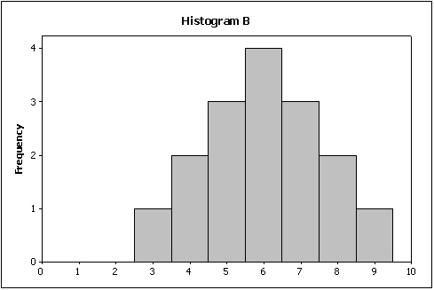
Compare the two histograms below. Which statement is true? 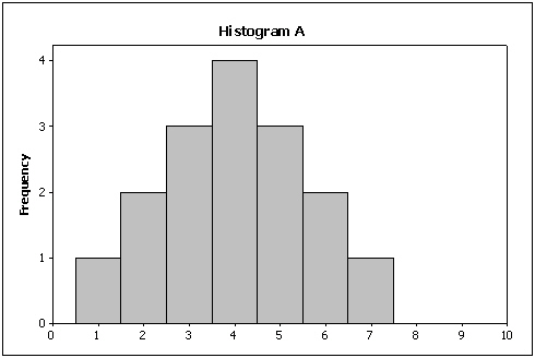
(Multiple Choice)
4.8/5 (27)
You cannot calculate and interpret differences between numbers assigned to nominal data.
(True/False)
4.8/5 (39)
What values are displayed on a cumulative relative frequency distribution?
(Multiple Choice)
4.9/5 (37)
A(n)____________________ distribution lists the categories of a nominal variable and the proportion with which each occurs.
(Short Answer)
4.9/5 (36)
From a pie chart you are able to find the frequency for each category.
(True/False)
4.9/5 (34)
We create a frequency distribution for interval data by counting the number of observations that fall into each of a series of intervals, called ____________________.
(Short Answer)
4.7/5 (34)
A histogram is said to be symmetric if, when we draw a vertical line down the center of the histogram the two sides are nearly identical.
(True/False)
4.9/5 (36)
A line chart is created by plotting the value of the variable on the ____________________ axis and the time periods on the ____________________ axis.
(Short Answer)
4.8/5 (42)
Identify the type of data for which each of the following graphs is appropriate.
a. Pie chart
b. Bar chart
(Essay)
4.8/5 (34)
Time series data are often graphically depicted on a(n)____________________, which is a plot of the variable of interest over time.
(Short Answer)
4.8/5 (35)
Filters
- Essay(0)
- Multiple Choice(0)
- Short Answer(0)
- True False(0)
- Matching(0)