Exam 2: Graphical and Tabular Descriptive Techniques
Exam 1: What Is Statistics41 Questions
Exam 2: Graphical and Tabular Descriptive Techniques199 Questions
Exam 3: Numerical Descriptive Techniques226 Questions
Exam 4: Data Collection and Sampling82 Questions
Exam 5: Probability212 Questions
Exam 6: Random Variables and Discrete Probability Distributions174 Questions
Exam 7: Continuous Probability Distributions167 Questions
Exam 8: Sampling Distributions133 Questions
Exam 9: Introduction to Estimation88 Questions
Exam 10: Introduction to Hypothesis Testing186 Questions
Exam 11: Inference About a Population76 Questions
Exam 12: Inference About Comparing Two Populat85 Questions
Exam 13: Inference About Comparing Two Populat85 Questions
Exam 14: Analysis of Variance127 Questions
Exam 15: Chi-Squared Tests118 Questions
Exam 16: Simple Linear Regression and Correlat238 Questions
Exam 17: Multiple Regression147 Questions
Exam 18: Review of Statistical Inference189 Questions
Select questions type
The sum of the relative frequencies for all classes in a histogram always equals
(Multiple Choice)
4.9/5  (34)
(34)
When a distribution has more values to the left and tails off to the right, it is skewed negatively.
(True/False)
4.7/5 (34)
Values must represent ordered rankings for what type of data?
(Multiple Choice)
4.7/5 (31)
A(n)____________________ is a table that sorts data into class intervals (categories)and gives the number of observations in each interval (category).
(Short Answer)
4.7/5 (39)
For what type of data are frequencies the only calculations that can be done?
(Multiple Choice)
4.8/5 (38)
With nominal data, there is one and only one way the possible values can be ordered.
(True/False)
4.8/5 (35)
The number of houses sold in Miami Springs and the average monthly mortgage rates for 18 months randomly selected between January 2011 and April 2013 are shown in the following table.
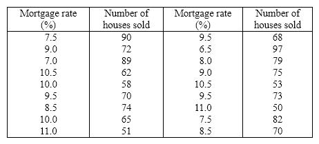 a. Draw a scatter diagram with the number of houses sold on the vertical axis.
b. Describe the relationship between mortgage rate and number of houses sold.
a. Draw a scatter diagram with the number of houses sold on the vertical axis.
b. Describe the relationship between mortgage rate and number of houses sold.
(Essay)
4.9/5 (35)
A graph of the frequency distribution for interval data is called a(n)____________________.
(Short Answer)
5.0/5 (33)
Which of the following situations is best suited for a pie chart?
(Multiple Choice)
5.0/5 (35)
Your final grade in a course (A, B, C, D, E)is a nominal variable.
(True/False)
4.8/5 (35)
Which of the following is the method statisticians use to draw the best fitting straight line through the data on a scatter diagram?
(Multiple Choice)
4.9/5 (26)
Business School Graduates A sample of business school graduates were asked what their major was. The results are shown in the following frequency distribution. 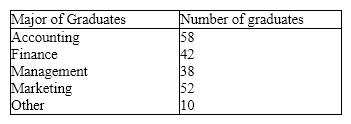 {Business School Graduates Narrative} Draw a pie chart of this data. Are you able to reconstruct the original data from this pie chart alone?
(Essay)
4.9/5 (43)
Which of the following describes the shape of the histogram below? 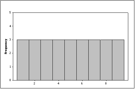
(Multiple Choice)
4.9/5 (28)
Compare the two histograms below. Which statement is true? 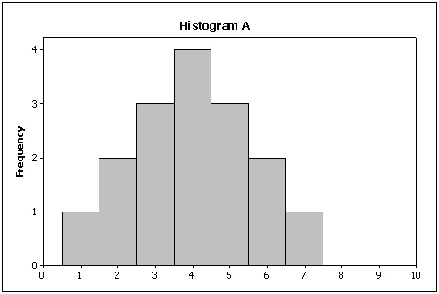
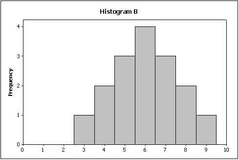
(Multiple Choice)
4.7/5 (35)
Teachers Ages The ages (in years)of a sample of 25 teachers are as follows: 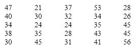 {Teachers Ages Narrative} Draw a frequency histogram of this data which contains four classes. What is the shape of the histogram?
(Essay)
4.9/5 (31)
The more observations we have, the ____________________ the number of class intervals we need to use to draw a useful histogram.
(Short Answer)
4.9/5 (39)
Internet Classes A survey of 25 students was conducted to determine how they rate the quality of Internet classes. Students were asked to rate the overall quality from 0 (no quality at all)to 100 (extremely good quality). The stem-and-leaf display of the data is shown below. 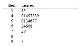 {Internet Classes Narrative} What percentage of the students rated the overall quality of on-line classes as being between 50 and 75, inclusive?
(Essay)
4.8/5 (37)
The original observations cannot be determined once they are grouped into a frequency distribution.
(True/False)
4.7/5 (32)
When a distribution has more values to the right and tails to the left, we say it is skewed negatively.
(True/False)
4.8/5 (35)
Filters
- Essay(0)
- Multiple Choice(0)
- Short Answer(0)
- True False(0)
- Matching(0)