Exam 2: Graphical and Tabular Descriptive Techniques
Exam 1: What Is Statistics41 Questions
Exam 2: Graphical and Tabular Descriptive Techniques199 Questions
Exam 3: Numerical Descriptive Techniques226 Questions
Exam 4: Data Collection and Sampling82 Questions
Exam 5: Probability212 Questions
Exam 6: Random Variables and Discrete Probability Distributions174 Questions
Exam 7: Continuous Probability Distributions167 Questions
Exam 8: Sampling Distributions133 Questions
Exam 9: Introduction to Estimation88 Questions
Exam 10: Introduction to Hypothesis Testing186 Questions
Exam 11: Inference About a Population76 Questions
Exam 12: Inference About Comparing Two Populat85 Questions
Exam 13: Inference About Comparing Two Populat85 Questions
Exam 14: Analysis of Variance127 Questions
Exam 15: Chi-Squared Tests118 Questions
Exam 16: Simple Linear Regression and Correlat238 Questions
Exam 17: Multiple Regression147 Questions
Exam 18: Review of Statistical Inference189 Questions
Select questions type
The classification of student class designation (freshman, sophomore, junior, senior)is an example of a(n)
(Multiple Choice)
4.8/5  (34)
(34)
If two variables have a strong linear relationship, that means one variable is causing the other variable to go up or down.
(True/False)
4.9/5 (35)
According to the stem-and-leaf plot below, the median quiz score for this data set is 8. 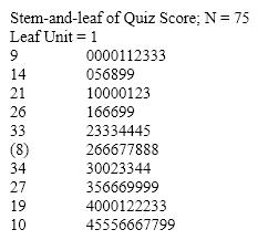
(True/False)
4.9/5 (30)
In a pie chart, each slice is proportional to the ____________________ of individuals in that category.
(Short Answer)
4.9/5 (32)
A line chart that is flat shows no fluctuation in the variable being presented.
(True/False)
4.7/5 (35)
A(n)____________________ histogram has two peaks, not necessarily equal in height.
(Short Answer)
5.0/5 (27)
Electronics Company At a meeting of regional offices managers of a national electronics company, a survey was taken to determine the number of employees the regional managers supervise in the operation of their departments. The results of the survey are shown below. 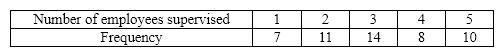 {Electronics Company Narrative} Across all of the regional offices, how many total employees were supervised by those surveyed?
(Essay)
4.9/5 (26)
Interval data, such as heights, weights, and incomes, are also referred to as quantitative or numerical data.
(True/False)
4.8/5 (28)
Observations that are measured at the same time represent what type of data?
(Multiple Choice)
4.8/5 (42)
The two most important characteristics to examine in a scatter diagram are the number of possible categories for X and Y and the number of observations in each category.
(True/False)
4.9/5 (33)
Before leaving a particular restaurant, customers are asked to respond to the questions listed below. For each question, determine whether the possible responses are interval, nominal, or ordinal.
a. What is the approximate distance (in miles)between this restaurant and your residence?
b. Have you ever eaten at this restaurant before?
c. On how many occasions have you eaten at the restaurant before?
d. Which of the following attributes of this restaurant do you find most attractive: service, prices, quality of the food, or the menu?
e. What is your overall rating of the restaurant: excellent, good, fair, or poor?
(Essay)
4.8/5 (40)
Briefly explain the difference between correlation and causation in terms of a relationship between X and Y .
(Essay)
4.9/5 (32)
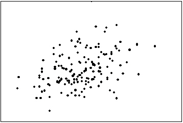
The first scatter diagram below shows a stronger linear relationship than the second scatter diagram. (Assume the scales on both scatter diagrams are the same.) 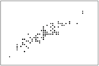
(True/False)
4.9/5 (42)
Experience shows that few students hand in their statistics exams early; most prefer to hand them in near the end of the test period. This means the time taken by students to write exams is positively skewed.
(True/False)
4.8/5 (36)
Give an example of interval data that can also be treated as ordinal data and nominal data.
(Essay)
4.8/5 (36)
The line chart below shows potato prices per pound for each month from January (month 1)to December last year. By looking at this chart you can see the lowest potato prices occurred in ____________________. 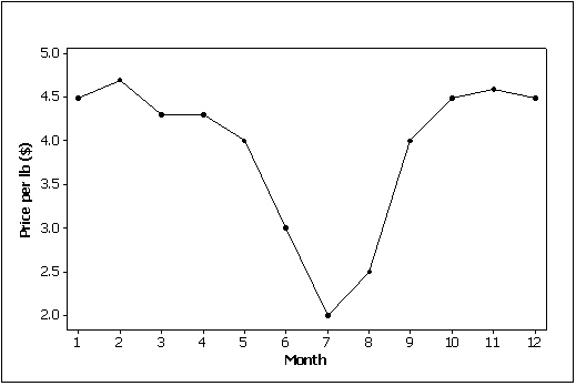
(Short Answer)
4.7/5 (35)
Filters
- Essay(0)
- Multiple Choice(0)
- Short Answer(0)
- True False(0)
- Matching(0)