Exam 2: Tabular and Graphical Methods
Exam 1: Statistics and Data68 Questions
Exam 2: Tabular and Graphical Methods99 Questions
Exam 3: Numerical Descriptive Measures123 Questions
Exam 4: Basic Probability Concepts107 Questions
Exam 5: Discrete Probability Distributions118 Questions
Exam 6: Continuous Probability Distributions114 Questions
Exam 7: Sampling and Sampling Distributions110 Questions
Exam 8: Interval Estimation111 Questions
Exam 9: Hypothesis Testing111 Questions
Exam 10: Statistical Inference Concerning Two Populations104 Questions
Exam 11: Statistical Inference Concerning Variance96 Questions
Exam 12: Chi-Square Tests100 Questions
Exam 13: Analysis of Variance89 Questions
Exam 14: Regression Analysis116 Questions
Exam 15: Inference With Regression Models117 Questions
Exam 16: Regression Models for Nonlinear Relationships95 Questions
Exam 17: Regression Models With Dummy Variables117 Questions
Exam 18: Time Series and Forecasting103 Questions
Exam 19: Returns, Index Numbers and Inflation98 Questions
Exam 20: Nonparametric Tests99 Questions
Select questions type
The accompanying chart shows the numbers of books written by each author in a collection of cookbooks.What type of chart is this? 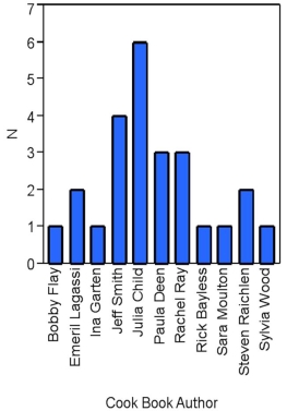
(Multiple Choice)
4.8/5  (21)
(21)
A bar chart depicts the frequency or relative frequency of each category of qualitative data as a bar rising vertically from the horizontal axis.It is also acceptable for the bar to extend horizontally from the vertical axis.
(True/False)
4.7/5  (40)
(40)
Exhibit 2-9.An analyst constructed the following frequency distribution on the monthly returns for 50 selected stocks:  Refer to Exhibit 2-9.The number of stocks with returns of 0% up to 10% is ________.
(Multiple Choice)
4.9/5  (42)
(42)
Exhibit 2-8.Consider the following frequency distribution. 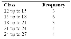 Refer to Exhibit 2-8.The total number of observations in the frequency distribution is _____.
(Multiple Choice)
4.8/5  (38)
(38)
When constructing a scatterplot for two quantitative variables,we usually refer to one variable as x and another one as y.Typically,we graph x on the vertical axis and y on the horizontal axis.
(True/False)
4.8/5  (25)
(25)
Exhibit 2-5.The following data represent scores on a pop quiz in a statistics section:  Refer to Exhibit 2-5.Suppose the data on quiz scores will be grouped into five classes.The width of the classes for a frequency distribution or histogram is closest to _____.
(Multiple Choice)
4.9/5  (34)
(34)
Exhibit 2-11.The accompanying relative frequency distribution represents the last year car sales for the sales force at Kelly's Mega Used Car Center. 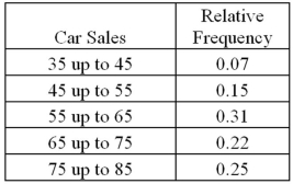 Refer to Exhibit 2-11.If Kelly's employs 100 salespeople,how many of these salespeople have sold at least 65 cars in the last year?
(Multiple Choice)
5.0/5  (37)
(37)
Exhibit 2-13.The organization of the Girl Sprouts has completed its annual cookie drive.The sales are reported in the accompanying ogive. 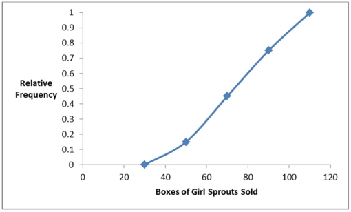 Refer to Exhibit 2-13.Approximate the percentage of girls who sold less than 90 boxes of cookies.
(Multiple Choice)
4.9/5  (38)
(38)
The accompanying chart shows the number of books written by each author in a collection of cookbooks.What type of data is being represented? 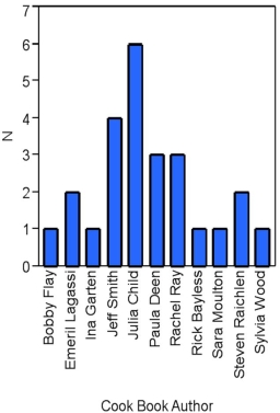
(Multiple Choice)
4.9/5  (31)
(31)
A statistics instructor computes the grade and percentage of classes that each of his students attends.Construct a scatterplot from the data displayed next.Does a relationship exist between attendance and grade? 
(Essay)
4.9/5  (31)
(31)
An ogive is a graph that plots the cumulative frequency (or the cumulative relative frequency)of each class above the lower limit of the corresponding class.
(True/False)
4.7/5  (38)
(38)
Exhibit 2-2.The following is a list of five of the world's busiest airports by passenger traffic for 2010.  Refer to Exhibit 2-2.The percentage of passenger traffic in the five busiest airports that occurred in Asia is closest to __________.
(Multiple Choice)
4.9/5  (34)
(34)
Exhibit 2-9.An analyst constructed the following frequency distribution on the monthly returns for 50 selected stocks: 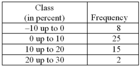 Refer to Exhibit 2-9.The proportion of stocks with returns of 0% up to 10% is _____.
(Multiple Choice)
4.8/5  (32)
(32)
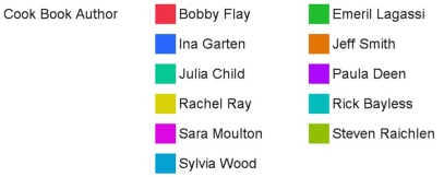
In the following pie chart representing a collection of cookbooks,which author has more titles? 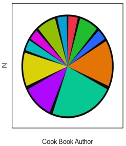
(Multiple Choice)
4.8/5  (28)
(28)
Exhibit 2-5.The following data represent scores on a pop quiz in a statistics section: 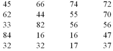 Refer to Exhibit 2-5.Suppose the data is grouped into 5 classes,and one of them will be "30 up to 44"-that is,{x;30 ≤ x < 44}.The frequency of this class is ____.
(Multiple Choice)
4.8/5  (30)
(30)
For which of the following data sets will a pie chart be most useful?
(Multiple Choice)
4.8/5  (30)
(30)
What graphical tool is best used to display the relative frequency of grouped quantitative data?
(Multiple Choice)
4.8/5  (36)
(36)
Exhibit 2-3.A city in California spent six million dollars repairing damage to its public buildings in 2010.The following table shows the categories where the money was directed. 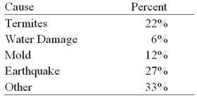 Refer to Exhibit 2-3.How much did the city spend to fix damage caused by mold?
(Multiple Choice)
4.9/5  (27)
(27)
Showing 41 - 60 of 99
Filters
- Essay(0)
- Multiple Choice(0)
- Short Answer(0)
- True False(0)
- Matching(0)